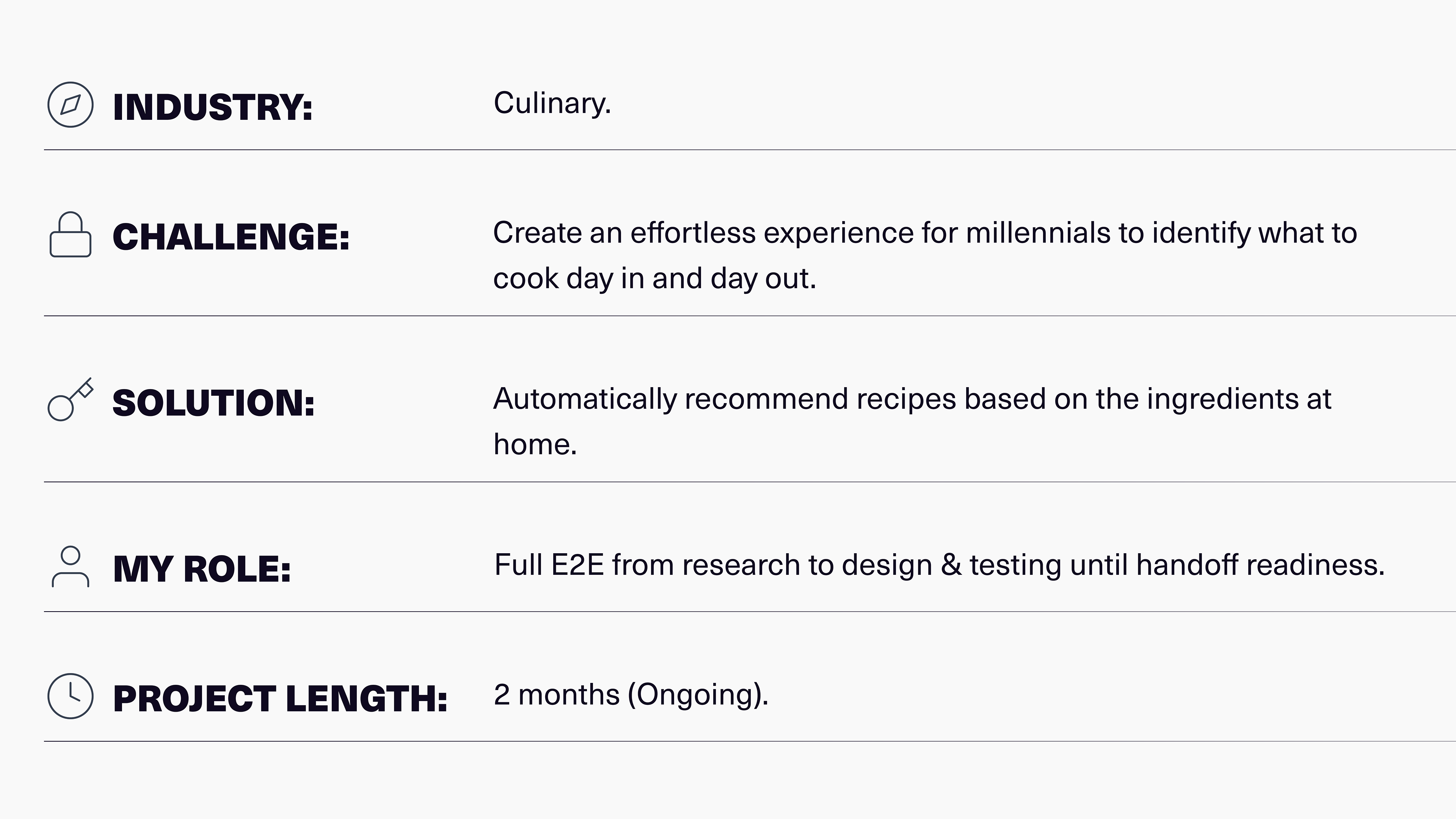
Background
"I don't have time for…" seems to be the default answer when asking millennials in the workplace about their cooking habits. Most seem to suffer from cognitive fatigue when searching for recipes to aid or enhance their cooking. However, millennials still need to cook for health and economic reasons, but thinking about what meals to cook during the week can be a real burden.
I believe there is an opportunity to design a solution to alleviate users' cognitive fatigue of thinking about meals. With that in mind, the proposal is to create a meal recipe app that considers the user's ingredients at any given time and automatically recommends recipes based on that set of ingredients.
Few to no products in the market recommend recipes based on the ingredients one has at home, and most seem to offer a vast catalogue of recipes without a proper narrowing on what the user needs at each particular moment. The user must always search by themselves as best they can from a vast catalogue of recipes.
Design Methodology
This project dealt with a mature market filled with endless solutions for recipes and meal prep catered to all sorts of users. Therefore, I feared designing an existing solution with a new coat of paint or designing something else that was unnecessary. In short, I was fearful of creating the wrong thing. To mitigate that risk, I knew I had to remain flexible and quickly answer the question: "Do users need another cooking app?"
For this reason, I adopted a Lean UX framework. Although it is mainly used in teams for its collaborative focus, it can be applied whilst working individually because it helps keep a flexible mindset, not shying away from going back to square one if that is required to ensure one is designing the right thing.
In addition, it would allow me to go through each design phase much quicker, making it easier to go back to the drawing board, which would be difficult if I were to conduct lengthy stages of research and ideation.

Think
The primary objective of the research was to see if users could benefit from another cooking app. A brief secondary research suggested no other solutions recommended recipes based on available ingredients, but did users want this?
This became the primary research objective, which looked at how users approach cooking recipes and how that impacts their cooking habits.
I Interviewed nine millennials from different countries and backgrounds who were between the ages of 26 & 35, living by themselves with long work schedules and who cook regularly. This was followed by surveys sent to a broader audience to see if the quantitative data supported the interview findings.
Insights
INSIGHT #1
Users consult recipes according to their available resources to manage their time better.
Users do not plan their meals. Instead, they have a basic understanding of the general ingredients they need and use part of their downtime to look at cooking recipes to help them save time thinking and guessing what to cook.
a) 75% of users spend less than 15 minutes searching for a recipe.
b) Only 2.3% of users plan their meals.
Insight #2
Video helps users better understand and replicate the recipes.
Video gives visual confirmation to the user that what they are doing is indeed what the recipe requires. It provides additional contextual information that helps users understand broad concepts.
a) 93% of users use digital products to consult recipes.
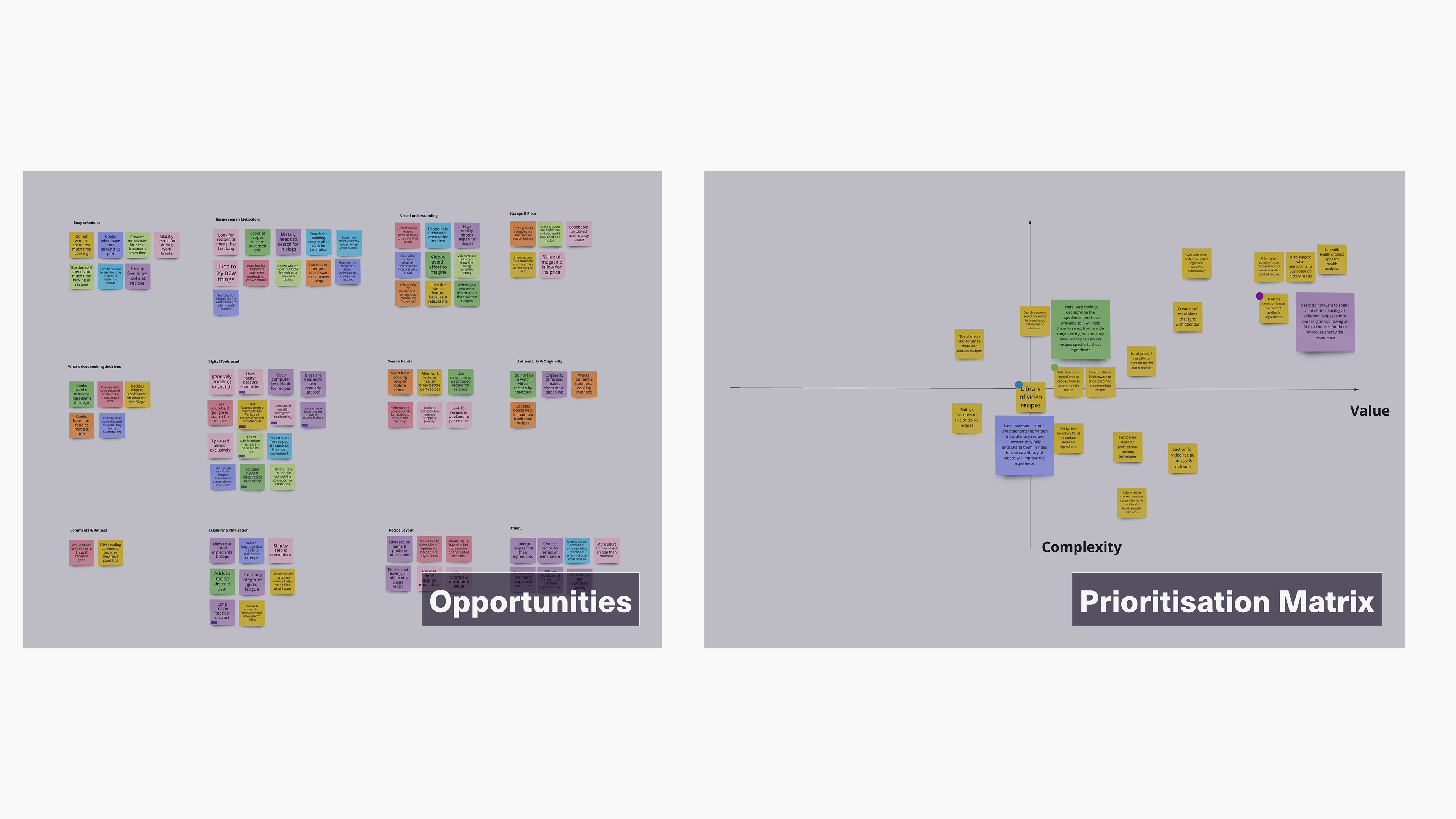
Opportunities
I was happy to see that there was indeed an unmet need that needed solving through a tailored recipe-based solution application. With that in mind, the data was further grouped into themes and opportunities to guide the ideation of features.
The list of features was then mapped against a prioritisation matrix to identify features with the highest value and lowest complexity.
Make
To translate all previous findings in terms of the number of screens and points of interaction between them, I developed several user flows that would give me a comprehensive understanding of the entire e2e user process.
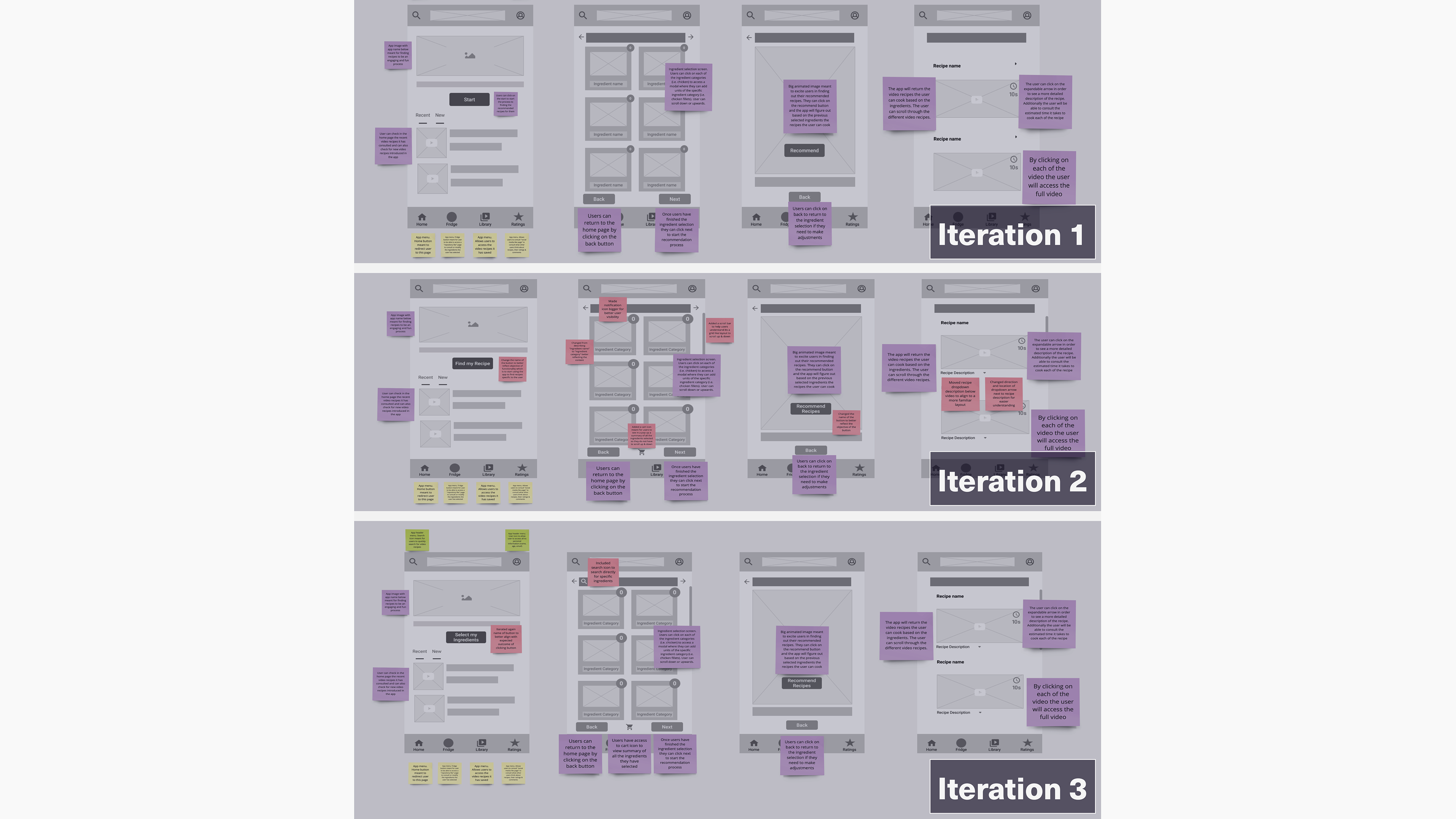
Using the user flows as a guide; I conducted some crazy 8s and sketched layout options before wireframing the solution. This allowed me to quickly come up with ideas I could then tweak or add upon as I sketched on paper. I went through several sketches, trying out different versions until I arrived at a layout I was happy with. I annotated the functionality of each element in the layout and how it could improve the user experience. This would help me be consistent when developing the wireframes and prototypes later on.

Wireframing
I decided to develop wireframes before the prototype because it helped me better translate the paper sketches into the skeleton for the actual content layout of the prototypes. Additionally, developing wireframes would allow me to conduct early testing to see the user’s reaction to an earlier build and start iterating as early as possible.
To that end, I conducted several rounds of testing with a handful of participants. This allowed me to see gaps in the current layout structure and iterate upon them quickly.
Rapid Prototyping
With an iterated structure set in place, the focus shifted to implementing those wireframes into a clickable prototype that could be tested as soon as possible to enable an iterative validation process that would ensure each building component was tailored to the user's needs.
However, I couldn't invest much time in producing a high-fidelity prototype where any significant change or tweak would prove a major headache. Instead, I designed a "concept prototype" with a high enough fidelity to allow users to imagine how the app would look and feel. Although this would still be a concept and not the final mockup, it would still allow for receiving all the necessary feedback from users.

Check
Accessibility Testing
It was essential from the get-go for the app to be accessible to most millennials in the workplace. This meant it had to consider users with any kind of visual challenge. Therefore, before testing the “concept prototype” with users, I validated all the designs against WebAIM to ensure I met AA & AAA standards. Most of the designs met AAA standards. However, specific issues popped up regarding colours as they performed below expected AA standards. It was also detected that text on some parts of the design could be improved to be more legible.
Usability Testing
Testing was conducted using lookback because it allowed me to test remotely with participants who lived in another country. It also allowed me to test without the necessity of being present to facilitate the session. This was important as other participants lived in different time zones, so they could test whenever suited them best.
The main objective throughout this exercise was to test if any blockages prevented the user from getting quickly from the home page to selecting its ingredients to find the recommended recipes. A secondary objective was to find out elements that, though they do not impede the user from being able to finish the intended task, may cause distraction or confusion (examples: colours, button positioning, eligible text, sizing, imagery, etc.).
I was pleased with the overall results and feedback as most features performed well with 100% of users, for instance, being able to quickly navigate from the home screen to the modal of the individual ingredient selection, which assured me that CTA placement and overall layout structure helped users arrive at their goals quickly.
However, 90% of users could not access the ingredient description feature. A feature that provides users with information on each ingredient.
KPIs - Google’s HEART framework
To measure the impact of the design on a broad scale, I focused on a main KPI: “Increase Task Success Rate”. I used Google’s HEART framework because it is straightforward to implement and measure.
The focus was on the “T” - Task Success - so I could accurately measure whether users could access the desired features or the length it took them to get there.

I formulated the following hypothesis to address the issue behind accessing the information on each ingredient:
“Substituting the current iconography and overall layout of the ingredient card component will increase the task success rate for visualising ingredient descriptions.”
Re-Make
Mockup
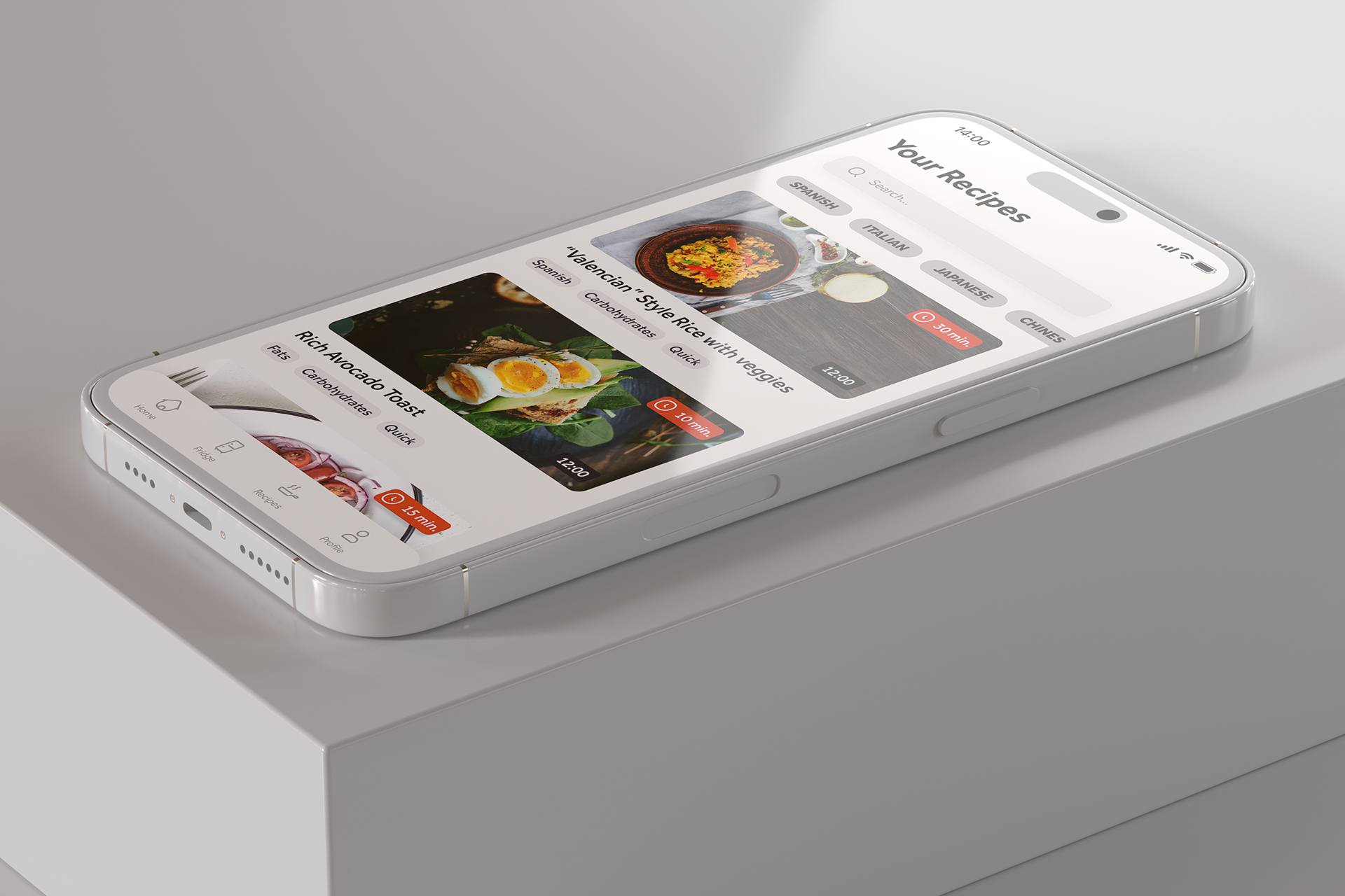
Home Page
It was designed to quickly point the users towards selecting their ingredients so they can get their new recommended recipes but allow them to revisit recent recipes if they prefer to choose that pathway.

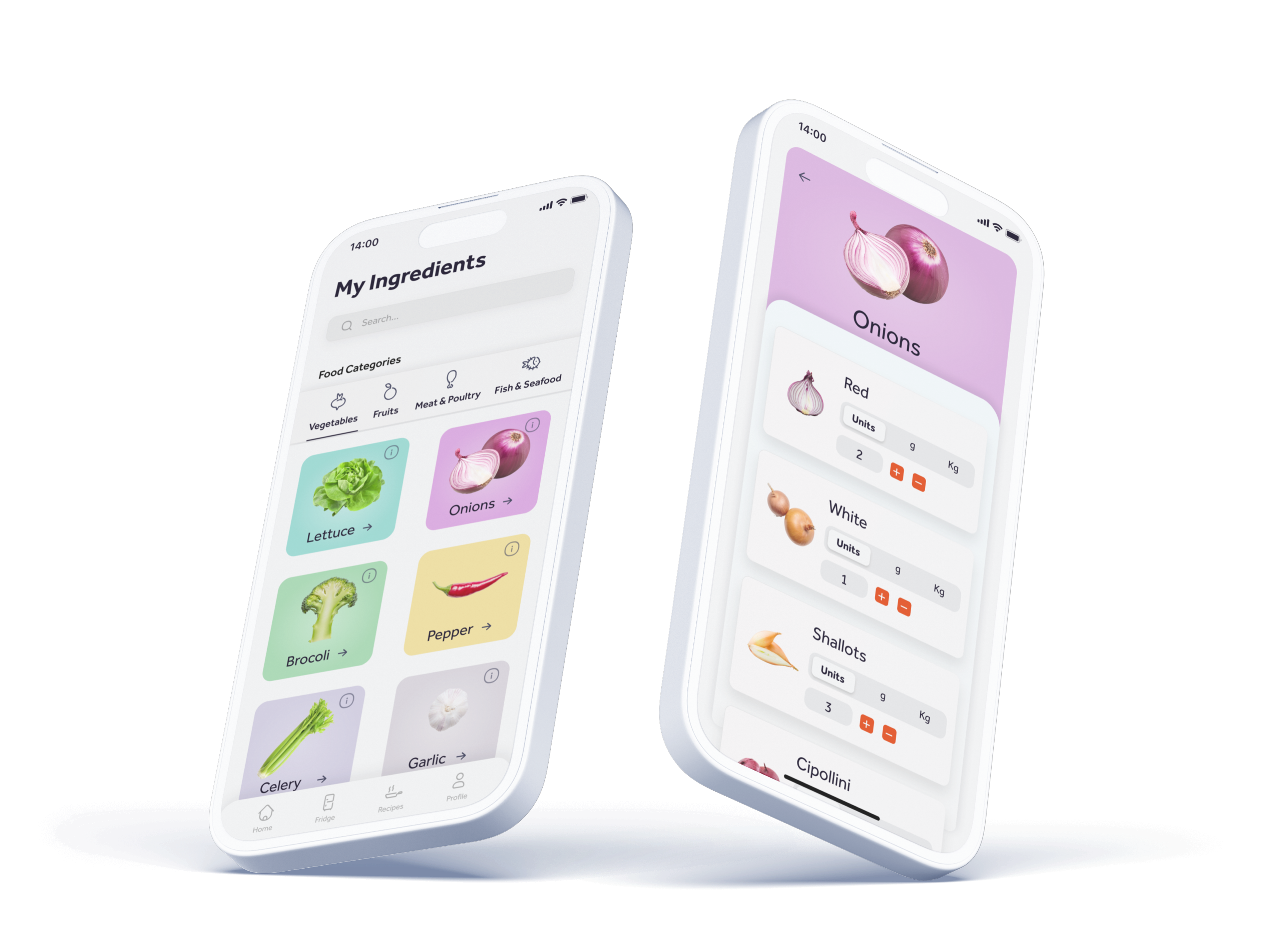
Ingredient Categories Page
It was meant to be eye-catching, so choosing ingredients wouldn't become tedious. Following the KPIs, the card components were redesigned to be simpler whilst showcasing all the features.
Ingredient Details Page
It was introduced as a natural subcategory to the ingredient page with straightforward controls and ease of changing selection if users have made a mistake or want to revisit their choice.
Video Recipe Page
It was intended to use appealing video visuals, allowing for easy filtering of the current selection and providing the necessary information to help users choose their preferred recipe.

Conclusions
Thinking about what to cook day in and day out can be a real burden for most. It is a particular struggle for most millennials with long working hours. However, with so many recipe solutions, is there an opportunity for a digital product to solve this problem? The research points to “yes”.
I have enjoyed this project for its ability to keep me constantly testing and iterating. Uncertain at times of knowing if my designs would hit the mark, I was always relieved to know I would test them out before committing.
Next Steps
Moving forward with the project, I would go back to sketching to design some of the different functionalities gathered from user interviews, such as a rating system that could be shared amongst users. I would then go ahead and thoroughly test them out.
Lessons Learned
#1 Don’t overlook emotional design
I ended up designing a whole page with a single CTA but surrounded by solid imagery to evoke in users a feeling of excitement before accessing the recommended video recipes.
#2 Always remember, “I am not my user.”
Certain design choices seemed in my mind like the right fit for the user; they followed the applied design principles, but the user did not fully comprehend them later on when tested.
#3 If possible, always gather more data
Recruiting additional users for interviews or sending surveys to more respondents gave me a better insight into the actual problems to help me make better design decisions.